Friday 29 November 2013

New Work from Make Art that Sells Course


Some of my new work completed as part of the Make Art That Sells Course (Part B) ran by my US agent Lilla Rogers. 

Top piece was for Scrapbooking Week. I knew almost nothing about scrapbooking (as not so big here in the UK as in the USA) but I really enjoyed the project as it allowed for the creation of lots of icons and images but without feeling the pressure when laying it out for it to need to work as a repeat. It also gave me the opportunity to really look at my partner's collection of vintage cameras....shocking how things can be in our home and I realise I've never properly looked at them before.

Party Paper on a Folk theme - I really loved working on this. Usually I draw lots of my elements separately and them scan and assemble inside my computer but for this I challenged myself to draw the whole of the plate in one go.

Christmas Card for Stationery Week. The turquoise angel decoration came out every Christmas when I was small and a few years ago my Mum gave her to me.

Thursday 10 October 2013

Moyo Directory


A few weeks ago I got the opportunity to add a portfolio to the newly launched Moyo Directory.
I haven't updated my website for a very long time (I can feel myself cowering with shame as I type this!!!) so it was really refreshing to see all my recent work together. And it's motivated me to make plans to update my own site.

A little bit about MOYO from their website - 
"The MOYO directory was founded by internationally acclaimed surface pattern designer Rachael Taylor and award-winning entrepreneur Beth Kempton to connect designers worldwide with job opportunities, and provide a place to showcase their work in the company of other designers. Rachael and Beth are also co-founders of MOYO, the world's first online magazine dedicated to surface pattern design and the wildly popular design school 'The Art and Business of Surface Pattern Design'."

Tuesday 24 September 2013

Auditory Processing Disorder Illustration


A recent illustration for Bulletin Magazine about a child with Auditory Processing Disorder. I love finding visual solutions to text that seems initially non visual and complex.

Thursday 19 September 2013

Anniversary Card for Trader Joe's


I received a few of these in the post recently - my artwork on anniversary cards for Trader Joe's. It was such a delight to see how beautifully these were designed and printed and on gorgeous paper. I did this illustration quite a while ago and seeing it being used again was a bit like discovering forgotten favourite winter clothes in the cupboard!

Monday 16 September 2013

Moo Business Cards


I ordered some new business cards recently from Moo.com. Before they existed, with the option of getting many images printed at once, my cards were always homemade as I could never choose just one image to represent me on a professionally printed business card. I remember from my postcard produced on leaving art college that by the time I'd given out a handful of the 200 my style have changed! (Although I still have some of that fox card from 1990 and I think my style has sort of looped back around in the twenty three years. If only I could have reassured my brother then that Photoshop was on its way and I wouldn't always have to draw directly on top of our grandfather's notebooks!)


My 1990 Promotional Postcard 


When I was laying out the Moo cards to photograph it reminded me of rainy days as a nanny spent on the floor playing Pairs with the children....thinking it might be fun to make some sets of the game.

Tuesday 10 September 2013

Drawing and Photographing Typewriters


Olivetti Museum Windows


I did these four thank you cards just before we went on holiday as a personal/speculative project. The top one is Dennis's Dad's typewriter which sits in their conservatory in Northumberland and his Dad still uses regularly.

When we got to Piazza San Marco in Venice Dennis teased me for turning my camera on the windows of the Olivetti Museum bordering the square....rather than the over photographed square itself. Though when I turned back I found him taking a close up of some cigarette butts on the ground with the towering Campanile in the background - which seemed far more sacrilegious!

Monday 9 September 2013

Wall Art Project


Two finished pieces

buttons and lamb that worked there way into finals
work in progress - background for top image


Back in June I took Part A of an e-course run by my agent Lilla Rogers called "Make Art that Sells". It was aimed at helping artists, illustrators and designers "up" their work to the next level and create work focused on five key commercial areas - Wall Art, Bolt Fabric, Children's Book Illustration, and artwork for Gifts and Homeware. There were around 500 participants from all over the world - many, many of them were already highly successful and talented artists and it was an initially nerve wracking, then challenging, followed by inspiring and completely invigorating experience to be thrown into such a school of high achievers! Lilla motivated and nurtured us all with such enthusiasm yet tenderness that I'm certain everyone will have come out of the experience feeling both creatively and emotionally stronger. 

Though I've been represented by Lilla Rogers Studio since 2007 and have had some success with licensing of artwork and crossing over into surface design - for cards, wrap, bags, rugs, swimwear - I still see myself very much coming from an editorial illustration background and training and it's in that area that the great majority of my work both in the UK and USA comes from. The course was a wonderful way to make me see the possibilities and applications for my work in a fresh way.

This project for the Wall Art week was definitely the one I most loved working on and helped break down old attitudes and assumptions. Several of Lilla's other artists have had lots of success with Wall Art including the beautiful work produced by Mati Rose, Lisa Congdon and Lisa De John. Initially I was concerned I somehow wouldn't fit this area as I don't come from a gallery/artist background - I see my work as being between paper, something that lasts the length of a magazine or the turning of a page not hanging on a wall. (Surely a throw back to my time studying Illustration at Maidstone College of Art where the courses were clearly delineated between Fine Art and Illustration....and my joyful cross overs into the Printmaking department felt like going behind enemy lines!) I'm also so used to responding to a brief that the opportunity to spend a day doing what ever I wanted with no final image in mind was amazingly liberating. I think I so love my job and the way I spend my days I hadn't considered until that day spent painting these backgrounds in the kitchen that it could be even more fun!

It was an amazing five weeks and Part B of the course starts next month...I'm already excited and ring fenced my autumn weekends for working on it!

Monday 20 May 2013

The Little Book of Wedding Etiquette


Just published last month by Running Press "The Little Book of Wedding Etiquette" was a lovely project to illustrate involving twelve chapter illustrations and a cover. And I managed to slip a wedding guest dog in too!


Friday 12 April 2013

The Aesthetic Anteater


I did this for a "facebook drawing club thing" that I was doing with some friends who are animators. The theme was the "Aesthetic Anteater" (chosen by me). As I've been feeling sad for anteaters ever since I learnt they were nomadic as I'm sure there are a few that would like a beautiful home to call their own. That's Heals window he is looking in....or maybe the Conran Shop.

Thursday 4 April 2013

Anthropologie/Front Row Society Scarf Design Competition


These are close ups of a piece I designed last autumn for a Front Row Society competition in collaboration with Anthropologie (a shop I adore!) The brief was to design a scarf 200cm x 65cm based on one of the four elements.

I chose Earth as it’s definitely the element I most connect with. I don’t think I’ve ever designed anything so big before! I called mine “Gone to Earth” – partly after the animals that live and seek refuge underground, the idea of returning to nature and after one of my favourite films with that name by Powell and Pressburger.

Tuesday 2 April 2013

Rhode Island magazine - Spring

 This was for Rhode Island Magazine to illustrate a piece by Ann Hood. It's was a very reflective and poignant piece of writing about Spring from early childhood memories of Easter celebrations with snow still on the ground surrounded by her extended Italian family through to the loss of family members and how it affected  her ability to notice or appreciate seasonal changes through to the springtime adoption of one of her children.


I've also included how the illustrations looked in the magazine layout - I really like how the designer laid out the pages, the text and the flowers against the clean white pages.


Thursday 28 March 2013

Decorating Eggs


I illustrated this book by Deborah Schneebeli-Morrell  a few years ago but thought of it again today. 

When small in Scotland on Easter Friday - my brother and I would paint hard boiled eggs or colour them with felt tip pens and then roll them down a hill, chasing after them until they smashed, then eat them as part of a picnic  - often the whites of the egg were very stained with colour from the shell! I never really understood why I was doing it - but it was to symbolise the rock rolling from Jesus's tomb. It's been pointed out to me that my family were three days early in celebrating this!

Tuesday 26 March 2013

Inspired Times Magazine


I was asked to write a bit about creativity and staying inspired for Issue 15 of the online magazine Inspired Times

http://issuu.com/inspiringnews/docs/inspired_times_issue_15/17

Thursday 21 March 2013

Map of Great Britain


I created this for Pedlars Product of the Month Competition. The theme was to create a piece of Wall Art on the theme of Great Britain. I think this is quite a nostalgic view of Great Britain – our industries have declined, our buses and Jaguars aren’t so beautiful now and our hedgerows don’t seem so full of flowers! Though we do still have lots of deer and puffins.

Wednesday 20 March 2013

Work for Illustrated Ape Magazine


In the autumn I was asked to contribute a double page illustration for a special issue of Illustrated Ape  - and my fourteen year younger self was super excited - I can still remember the thrill of seeing the first issue of the magazine in 1998 and feeling like it was a sign of a new emerging illustration "scene". The fact they asked me to contribute to a comic themed issue, printed in red and black and to illustrate a section of a really dark torch song seemed like a slip up - don't they know I mostly draw dogs in clothes and flowers?! However I loved the challenge as so often having a colour palette that isn't a natural choice to me or subject matter I wouldn't normally be asked to tackle are the types of things that move my work on.

Tuesday 19 March 2013

Four Seasons Illustrations


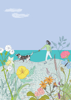
This was a project I did in December - it was a commission from a friend's husband to do four illustrations of his wife and dog through the seasons as a Christmas gift from him to her.

I loved working on this and producing a set of four meant it gave me the opportunity to play around more with scale and composition and viewpoints.


Saturday 12 January 2013

Drawing New Lines in the Sand

Sometimes I love to do really detailed work but I also love it when an art director is happy for me to go with a simple drawing as the solution. Looking from the objective outside I'm totally aware the idea/message the illustration is conveying is key and the length of time to produce it is irrelevant...but I do still have a small interior "voice" that sometimes says I should be working hard and long for my fee! It must be my Scottish work ethic :-)


LinkWithin

Related Posts with Thumbnails